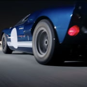
FORD vs FERRARI


Not just for Motor Rollers.

My friend Anup asked me for a film recommendation.
“Ford vs Ferrari,” I said.

So,
if you’re looking for a film recommendation,
you don’t have to.

That’s all folks.
Cue the music.

ps.
If you’re thinking
“Wait a sec, isn’t that film called something else?!”
You’d be right.
Depending on which country you’re in,
it’s also called Le Mans 66.

pps.
This post was not sponsored by The Walt Disney Company, nor Netflix.


Watch the Trailer

REFLECTIONS IN STORYLINES


“Have you noticed?”

The reflections in storylines.

There’s a point,
when your minds wide open,
to the world around you,
and patterns appear.

Especially when the things
you’ve been studying,
keep appearing.

As if they’re asking the question.

Ever since I started researching story structure – Joseph Campbell, Christopher Vogler, Dan Harmon etc etc – there’s a beautifully simple sense of joy when I notice elements of the structure play out in a film I’m watching, or a book I’m reading.

Knowing the structure of something,
recognising elements of detail,
allows you to appreciate a product
a little more.

Noticing the reflection
of the beginning,
in the ending,
brings a smile.

As if they’re asking the question.
“Have you noticed?”


‘Movement’ open toe bootie.

COUTURE – SS24 VALENTINO – A SELECTION

A selection from the recent SS24 Valentino Couture collection.
The shades of colour feel fresh, and mature.
Bold, and classic.
As much as I love zooming in to see the detail of the garment, or the heel of a shoe, it’s also interesting to pull back and see the collection at a distance.
To see how colours pop, or profiles flow.

Watch

INTERLUDES

This is my kind of collaboration.
Eclectic and Soulful.
My friend William Watson, and his friend Ebi Kagbala, are Death To Tennis, and they’ve been cultivating a series of interludes with musicians from New York City and Seoul.

Styled in Death To Tennis.
Rhythm their own.
Unique.

I’ve been listening to them for the last few days,
and this one is one of my faves.

Watch / Listen


ART BY ARNOLD.

My friend Arnold just posted a series of three drawings.
Each of them a face.
All amazing.
This is one.

see the rest here.


WOODTURNING BEAUTY.

A year ago I probably wouldn’t have imagined being so inspired by the art of woodturning.
And then I came across some artists creating vessels with a intriguing aesthetic.

Initially, the work of Greg Gallegos (above left) who’s based in Michigan,
and then more recently found Ash & Plumb (above right)
who are a bit closer to home in East Sussex.
Watch them craft


LOEWE SS24.

While watching the Loewe Women’s SS24,
this detail and craftsmanship,
the elegant choice of colour,
stunning.

The music was delicious too.
See the show


YOUR JOB AS AN ARTIST.

“Your job as an artist is to create meaning, create beauty, create transformative experience. You are an agent of culture, not a functionary of the social order.

Believe you are doing something meaningful every time you create a work of art. Everything you write, reflecting what is true. Everything you shape, reflecting your way of seeing. Everything you film or perform, brimming with the life in your heart and mind. Each of these is its own butterfly in the Amazon, no matter how insignificant you think its impact. You cannot know down the channels of time what it will touch or how it will transform the world.”

: Susan Dirende @susandirende

MORE CURIOSITY.

There is a book I might never finish reading,
with words that were never meant to be read.

The words of wisdom shared in Meditations
were Marcus Aurelius’ thoughts, for himself.

They weren’t preaching to others.
They were teaching himself.

Which shifts the perspective,
and feels like a lesson in itself.

More curiosity = less division.

More humility, and more creativity.


THE ART OF THE COVER.

After reading The Unbearable Lightness of Being early last year for the second time, I wondered about the art of the cover, and tracked down the artist’s own website.
David Miller’s work is nurtured from his fascination of Bohemian circus life and the Czech tradition of pantomime theatre. I assume his frequent visits to Prague brought him into contact with Milan Kundera. 


REFINED PALETTE

It was the refined palette and striking graphics – much like the American rock band The White Stripes – that what drew me to Haruki Murakami’s books, long before learning that they were also really good books.

Standing out on the shelves in a collective statement.
They’re a great example of book design and marketing, working beautifully together.

And so, I began my Murakami adventure with Norwegian Wood and Kafka On The Shore.
(both wonderful, and a little strange.)

The art for these covers were created by Suzanne Dean; the Creative Director at Vintage books.

In a recent instagram post Dean mentioned the source for some of the images used for the new cover designs for Ian McEwan’s catalogue (below).
One of them came from The Anonymous Project Collection – an intriguing source of vintage photographs I’d never heard of before.
It was for On Chesil Beach, and it shows how the strength of a fresh book design can reach a fresh audience, as well as rekindle a read from those who are already fans.

It’s in the art of the cover where we can make a connection, as well as the quality of the content.

Worth a post simply to remember that.